In the past 25 years, Kevin has developed different brands. He has also designed professional logos and developed website solutions for several organisations. In this portfolio, he showcases some of his favourite work and shares his insights behind the design.
Showcase 1 – Work it Out
Brand, Logo Design & Web Solutions
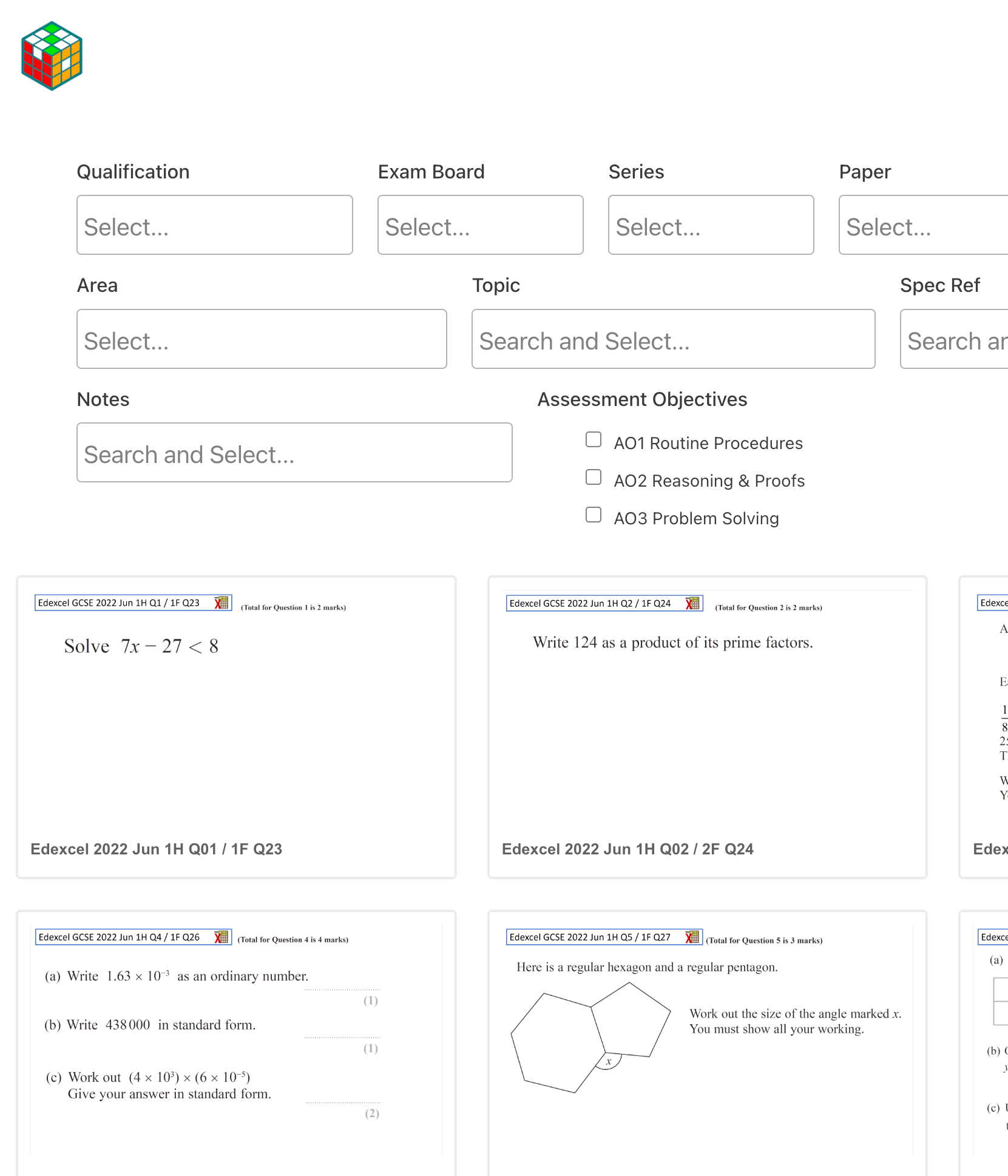
The project was to develop a brand, design a logo and develop a website solution that provides online resources for GCSE students studying mathematics in the UK. The brand “Work it Out” is a perfect phrase to encourage students to work out their maths questions. The style of the logo has a Rubik’s cube matching the “Work it Out” brand. Resolving a Rubik’s cube can take time but can also bring lots of fun, and so are the maths questions. The thick border of the hexagon represents the website is maths related. The letters “WIO” are hidden in the Rubik’s cube. Its colours are carefully selected to bring vibrant and active moods to the brand.
The website was developed with two principles in mind – simplicity and functionality to promote effective learning. Students can search their practice questions by various parameters and apply different filters within their searches. Then they are provided questions with suggested solutions and mark schemes which facilitate their learning. Students can also click on the links at the bottom of the question page to try other relevant questions by topics or any other parameters.
Showcase 2 – gifty & bccc
Brand and Logo Design

Gifty is a brand Kevin created for a card and gift retail business in Prestwich, Manchester in 2010. The brand is original, punchy, and easy to remember. It implies that the business is gift related. He co-designed the logo with Grace Cheung. The logo is a gift tied in a pretty bow and wrapped in colourful butterfly patterns. The gift also signifies a butterfly flying from the word ‘Gifty’. The four colours are carefully selected to hint at joy and celebrations. They also represent the four core businesses – cards, gifts, party balloons and accessories. The font style of the word ‘Gifty’ provides a unique and stylish sense to the potential customers that the shop is not just a simple card and gift shop around the corner.
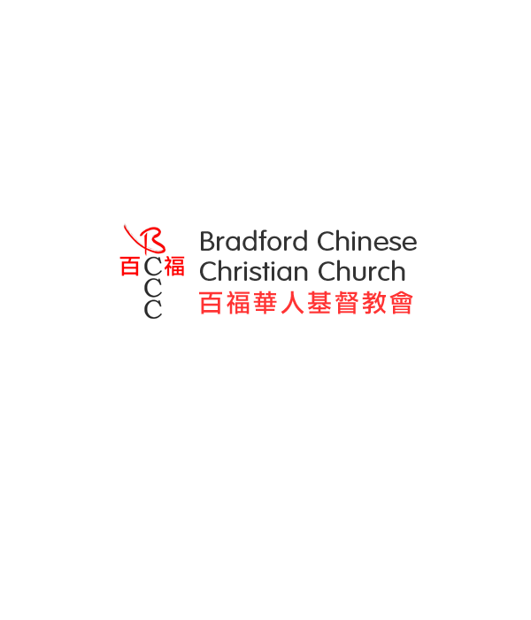
Kevin created the logo for the Bradford Chinese Christian Church in 2004. The logo symbolises a Christian cross with Chinese words and English characters ‘BCCC’. These Chinese words are the Chinese name of ‘Bradford’. The letter ‘B’ hides a significant meaning of the logo. After we turn the logo anti-clockwise by 90 degrees, it shows a hand-drawn heart and a horizontal line at the bottom. The horizontal line means ‘one’ in Chinese. ‘One’ and ‘heart’ together in Chinese imply the church promotes one united heart in Christ. The colour of the Chinese words and letter ‘B’ is carefully selected in red. Red colour generally represents the Chinese community. It is also the colour of the blood (Jesus’ blood). The words in red colour form an up arrow pointing to the top or Heaven.


